April’s showers are behind us, May’s flowers are bursting into bloom, and the world is spinning its way back to the hottest part of our orbit (for those of us in the Northern hemisphere, anyway) and that can only mean one thing — the Summer ’19 Release is almost here!
We’ve already taken a look at confetti, surveys, and enhanced related lists, today we’ll talk about some sweet new in-org branding enhancements: links, letterheads, and email updates!
Custom Color Hyperlinks
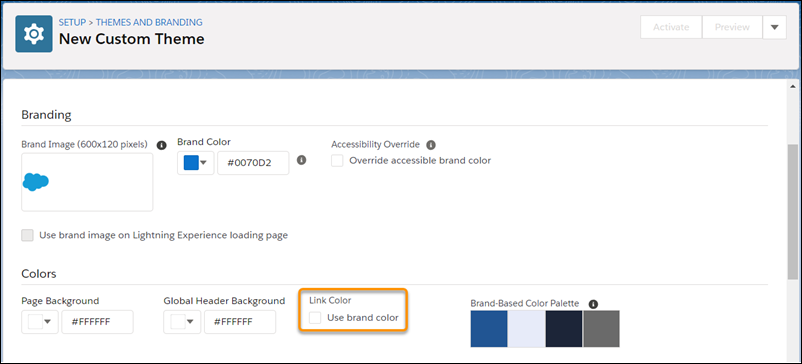
Whether you’re hoping to make your org more “on-brand” or just trying to help the important links stand out against the predominant blue of default Salesforce, you’ll finally have the power in June because Summer ’19 is introducing custom color hyperlinks!
Starting this summer, in Setup you’ll see a new field in the Themes and Branding section that’ll let you add some personalized (organization-alized?) style to your org. Implemented with the aim of helping companies and departments make their org’s feel more customized and less one-size-fits-all, we can’t wait to see all the other creative applications awesome admins come up with once it rolls out!

Email Upgrades
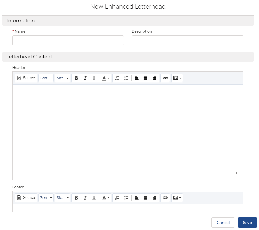
The Summer ’19 branding boost isn’t just for internally-facing features either, we’re also getting a lot more freedom to customize outbound interactions with new email updates! First up, Enhanced Letterheads will give admins the ability to add standardized (and branded) headers and footers to email templates, so you’ll finally have an easy way to unify the look and feel of your org’s messages. It’ll also make it an easy, one-stop-shop for adding your logo, relevant links, disclaimers, subscription options, etc…

And headers aren’t the only place getting the ability to display images, starting in Summer ’19 you’ll be able to add images to the body of emails as well! A brand new button on the editor will finally give you the chance to add some of that content that’s worth a thousand words from your computer, the web, or straight from the files you already host in your org!

Last but not least in email upgrades is a visibility improvement for users. Previously, when using the email template homepage or opening an email template in the Sales Console, some of the template was cut-off making it impossible to get a complete look at what you’d be sending to customers and prospects. That’s getting a fix in Summer ’19. Now the whole template will be visible on-screen and your users will know exactly what they’re sending, before they fire away!
So let your sales, marketing, and support teams know that, come Summer, Salesforce is going to be getting a lot more brand-friendly! And, if you need a hand figuring out how to make the most of the updates and upgrades, give us a call — we’re always happy to help!
Be sure to stay tuned here on the blog for one more release highlight before Summer officially hits and, in the meantime, keep working hard, smart, and happy. We’ll see you in the cloud.

